Which of the two scatterplots below do you look at longer?

People are drawn to beauty. Gazing upward in the Sistine Chapel, strolling through the Louvre, watching a sunset… people linger in settings like these because they’re beautiful. Because they linger, they recognize details they otherwise wouldn’t, and they may remember these moments for years to come. As performance scientists, when we present a report for a coach, athlete, or anyone else, we hope that they linger, learn and remember. By prioritizing data visualization and making our reports look better, we increase the likelihood that this happens.
Aesthetically appealing data visualization accomplishes at least three things in a performance environment. First, it captures your audience’s attention. This increases the likelihood of effectively communicating the message you’re delivering. Second, it puts your attention to detail on display. When people look at an appealing data visualization you’ve produced, they appreciate the time and care you took to craft it. Finally, it builds trust, buy-in and your “brand” within your team [6].
If you agree about the benefits of displaying your data well, but don’t know exactly where to start, this 10-step process will help set you on the road toward improving your data visualization skills. I can only skim the surface of each step in this piece, but if you are interested in learning about any of these things more deeply I reference more comprehensive resources throughout [3,8,11]. As a final note, I wrote this article to be platform agnostic. While I will provide examples from R and Tableau, these steps can apply with any software that you choose to use (e.g. Power BI, Microsoft Excel, Google Sheets, Python, Plotly, D3, etc).
Step 1: Make the commitment to take the extra step
Orient yourself in the right direction before you start making any plot. Creating detailed, beautiful plots takes more work than producing default, boring, bland charts. It is therefore vital to make the commitment that you aren’t necessarily done once you have a visualization – you just have the framework to beautify.
This is embedded into two of our guiding “Data Communication” principles at the Vancouver Whitecaps: 1) “We Don’t Do Ugly,” and 2) “Efficiently Beautiful.” In other words, we commit to taking the extra steps of trying to keep visualizations on-brand and aesthetically pleasing, while balancing the need to do this as efficiently as possible. We enhance efficiency through club visualization templates, preset club branded themes, established colour palettes and general departmental visualization principles.
Tweet ThisBy prioritizing data visualization and making our reports look better, we increase the likelihood that coaches and athletes linger, learn and remember
@johannwindt
Step 2: Know your purpose
Data visualization is fundamentally about communicating something from a data set. The underlying question, then, is “what are you trying to communicate?” Knowing and articulating your purpose for visualizing the data in the first place sets the stage for each of the following steps.
Questions and answers could include the following:
“Why are you making the visualization?”
- To better understand your data set (exploratory data analysis).
- To show a coach how athletes performed on a given fitness test.
- To demonstrate to an athlete how their performance has progressed across a season.
- To post a leaderboard on the wall.
- To create an interactive dashboard as part of an athlete management system.
“For whom are you making the figure?”
- Coaching staff
- An individual athlete
- The team
- All sports medicine / sports science practitioners
- Yourself
“Are you trying to communicate a particular finding, or allow the viewer to draw their own insight?”
- On one hand, a dashboard may facilitate practitioners’ ability to explore, so they can find different things they are looking for.
- On the other hand, specific design choices can effectively lead the viewer to a certain message you are trying to convey [12,14].
Let’s consider athlete load monitoring as one illustrative example of these different approaches. For the more direct, pointed purpose, let’s say a weekly loading report goes to the sport science and coaching staff to understand the loads for each athlete. You may deliberately exclude other available information (wellness, technical match performances) to highlight the loading progressions and emphasize athletes who may be under-loaded or over-loaded compared to their peers or the planned loading for the microcycle. You present the data in a way that draws their attention to these situations, and encourage them to consider whether an intervention is necessary.
On the exploratory end of the spectrum, the sport science and technical coaching staff may all agree that a given player isn’t performing up to expectations, but they aren’t sure why. Appropriate data visualization in this instance may display available information from their testing (e.g. force plates, standard submaximal test performance), loading (practice and match data) and match performances (e.g., technical and physical metrics from match event and tracking data). Here, you may deliberately avoid highlighting any specific aspect, and rather deliver the whole set to encourage exploration and discussion among the staff and potentially the player as well.
“Where does your viz fit on the spectrum between art and science?”
While most performance reporting is designed to communicate information as accurately as possible, there are times where visuals are more about their artistic qualities (e.g., generative art) (Generative Art with ggplot2 • ARtsy, 2021) than scientific communication.
These are instances where you may choose a less traditionally “effective” display simply because it is more visually appealing. #Dataviz Twitter recently blew up over a spiral plot in The New York Times showing COVID-19 data over the last three years [15]. Bringing the spiral plot into the sporting realm – even though a basic segment / line chart may be easier to interpret for a viewer (Figure 2, right) – may be the right choice because the more “artistic” spiral plot captures viewers’ attention more effectively (Figure 2, left).

Step 3: Know your tools – visual representations and pre-attentive attributes
When you visualize data, you encode a set of categorical and quantitative information into some visual representation that conveys meaning and helps your audience to interpret it. Why is this important?
First, interpreting a raw data table is hard. Even summary statistics can lead us astray, as often demonstrated by the “Datasaurus dozen” or Anscombe’s quartet [7]. Figure 3 shows three of the shapes in the Datasaurus dozen. These each have the same average x- and y-values, the same standard deviation for x- and y-values, and the same x-y correlation. Looking at these raw data points in a table or scanning these summary statistics, we would miss the very obvious patterns that arise when we visualize the data.

| Mean (SD) X = 54.3 (16.8) | Mean (SD) X = 54.3 (16.8) | Mean (SD) X = 54.3 (16.8) |
| Mean (SD) Y = 47.8 (26.9) | Mean (SD) Y = 47.8 (26.9) | Mean (SD) Y = 47.8 (26.9) |
| x-y correlation: r = -0.0641 | x-y correlation: r = -0.0641 | x-y correlation: r = -0.0641 |
Visual representation is extremely powerful. The human brain can assign meaning and even interpret certain image characteristics before you consciously think about the image. These image characteristics have been described as pre-attentive attributes [16].
Watch the following animation to see this in action. Make a mental note of how long it takes you to count how many soccer balls are in the image as it transitions from one image to the next.
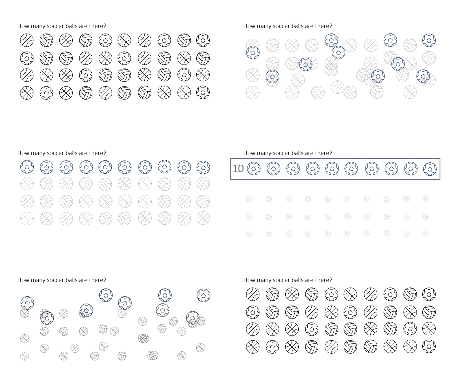
In this animated example, I used a collection of at least four different visual channel tools to progressively make the counting task easier. These same tools (Figure 5) can also facilitate conscious understanding of visualizations when the messages are more complex and are not pre-attentive [3].

Some resources rank these channels on effectiveness, while others don’t order them discretely. While some debates may ensue, there are some universally accepted distinctions. For example, humans interpret position on a common scale (like a bar chart) very easily and have trouble interpreting angles and proportions, as in a pie chart. This is one major contributing factor in all the pie chart hate from statisticians and data scientists. You can test this for yourself on the following image. Say there’s a league with five teams, and you want to show how many athletes play for team A, B, C, D and E. We’ve shown this using pie charts and bar charts. First, try to explain which teams (A to E) have more or fewer players from the pie charts. Then, see if you can decipher the groups more easily from the bar chart.

Bar and pie charts are just two examples, but once you recognize these visual tools, you can see how almost every type of data visualization relies on them.
For a flow chart of dozens of different chart types, along with corresponding code for how to build them, I highly recommend Data 2 Viz. The key to choosing the right chart is finding one that honestly represents the data with the right visual channel.
Step 4: Diagram it out
Brainstorming what you want a visualization to look like is one of the most creative parts of the journey. Use whatever medium you find easiest: a whiteboard, napkin, PowerPoint slide, notebook, blackboard or any other blank canvas to start mapping out your ideas of what you hope to put together. This can take two minutes, two days or two weeks. But getting an idea of where you’re going before you spin up your software of choice can almost always help catalyze the visualization process.
Step 5: Show the data
Sadly, the scientific literature is guilty of a plethora of sub-optimal data visualizations, with “dynamite plots” being one of the worst offenders [1,9]. As several people have highlighted, dynamite plots are among the visualizations that hide important information.
When you look at a dynamite plot (Figure 7, top), you have no way of knowing 1) how many observations exist in each group, 2) the full range of data points within each group, or 3) the distribution shape (skewed, normal, etc.) of observations within each group. Choosing a visualization that shows the actual data points and conveys these characteristics is better than one that hides them (Figure 7, bottom).

Step 6: Embed the data within context
When visualizing data as a performance practitioner, you are often showing some sort of testing or screening result for an athlete or team. Sarah ran the 100m in 12.2 seconds, Stu scored 32 points, Suzie’s max force outputs on the Nordbord were 352 N (right) and 349 N (left). The most common follow-up question from any basic table or graphic showing these types of results is, “Is that good?”
“Is that good?” is a contextual question. The answer always depends on the context to which you’re comparing the result. The slowest sprinter at the Olympic Games is going to be faster than the fastest athlete in almost any team sport environment. I’ve found that asking myself the question “compared to what” and then including that comparison in our visualizations preempts the inevitable “is that good?” Therefore, when displaying performance data, you may want to consider embedding the data within the most relevant context.
Take Figure 8 as an example of how important the comparison group can be. Using NFL combine data, I’ve assigned each player a normalized performance score (z-score) for each combine test, contextualizing it in two ways [18]. First, I scaled the scores based on the entire data set. Second, I re-calculated the performance scores for how each player ranks within their position. If you were to generate a “combine report” for a single player, the inferences you draw could vary notably depending on the calculation you choose.
In the case of Lane Johnson (the fourth overall pick in the 2013 draft), he would appear to be a player with generally “average” athletic qualities (with an impressive bench press) when compared to all athletes (Figure 8, left). However, when compared to only other offensive tackles, he stands out as an elite athletic talent (Figure 8, right). His upper body strength (bench press) also turns from his “strength” to his relatively weakest quality. Thus, changing the answer of “compared to what?” can have profound implications.

I have used each of the following reference categories listed below. Depending on the metric and the availability of these reference points, consider the following list when constructing your next viz.
- League averages
- Team averages
- Position averages
- Individual athlete averages
- Individual athlete results over time
- Expected bands (can be calculated / modeled on the factors of your choosing)
- Typical error bands, trends over time
Step 7: Display uncertainty
Uncertainty is guaranteed in performance science. No piece of technology is error free, no model predicts without imprecision and no data set is perfect. When visualizing data, it is important not to pretend that things are perfect, but instead to consider how to display the uncertainty honestly and accurately when possible.
Tweet ThisWhen visualizing data, it is important not to pretend that things are perfect, but instead to consider how to display the uncertainty honestly and accurately when possible.
@JohannWindt
When data are descriptive, showing the data (Step 5), goes a long way to displaying uncertainty. When data are modeled, including model error bars from the model is recommended.
The key here is to encourage the viewer to look at a result / visual and intuitively think: How big is this difference (signal)? How much error is inherent in this measure (noise)? And how confident am I that this difference or result is “real?”
In Figure 9, I chose to show some uncertainty in average bench press and 40-yard dash times for each position by including error bars that extend +/- 0.75 standard deviations (top), and I kept the grey band for the linear model showing the negative association between strength and speed when viewed across the whole data set. In the bottom plot, we note that this is a case of Simpson’s paradox. Although there is a significant negative association between strength and speed across the whole data set (top), when this association is plotted within each position group (bottom), the negative association disappears and, in some cases, is even slightly reversed.
Figure 9 then helps to show that, generally speaking, certain positions (e.g. offensive tackles) are strong and slow, others (e.g. wide receivers) weak and fast, or a mix of the two (tight ends). However, within each group you can expect to find players who are both faster and stronger than their positional peers.

Step 8: Consider interactivity
Interactive visualizations can change the game for your audience. Interactivity can facilitate a move from simply “telling” your viewer what to believe to inviting them to ask and answer their own questions. If exploration and interaction are the purposes of your data visualization, you must consider dynamic visualizations [2].

Step 9: Take the extra step
The first step I suggested was about mentally committing to taking the extra step. At this point in the journey, it is finally time to take it. You’ve mapped out a plan, chosen a viz, included the context, considered uncertainty and potentially made your visual interactive. The final step moves from the science of visual communication to the art of design, or, as Will Chase described it, the “Glamour of Graphics” [13]. A whole post could dive into these points in detail, but these are some simple tips to consider.
- Maximize data:ink ratio. [17] Edward Tufte wrote about this concept at length, but in essence it emphasizes that the “ink” in a visual should be conveying the data itself. Where it’s not (legends, gridlines, axis tick marks, etc.), it should be removed.
- Consider replacing your legend and labelling your title with the relevant colours instead.
- Usually, remove gridlines and axis tick marks.
- Consider removing axis labels and labelling points on your plot instead.
- Add more whitespace around your plots and within your dashboards.
- Consider small multiples / faceted plots (e.g., Figure 9. bottom).
- Left align titles with the whole plot, rather than the grid.
- Carefully consider your colour palettes. Reverting the whole plot with a grey palette and altering colour palettes and hues from that point can be a useful process.
- Consider accessibility, including alt-text and colour blind-friendly palettes [5].

Step 10: Stay curious and find inspiration
In his excellent article, Stephen Midway pens a liberating truth about data visualization:
“Much like statistical analyses often require expert opinions on top of best practices, figures also require choice despite well-documented recommendations. In other words, there may not be a singular best version of a given figure… ultimately design is a choice.”
Just like sport, data visualization is a game with general constraints in which we participate, but there are many paths to success. We can always learn, improve, adapt and grow. As good athletes grow up watching and emulating the greats that preceded them, all of us can look to our predecessors and peers for inspiration.
For me, I’ve gleaned inspiration from many others within and outside of sport. Depending on the platform I’m using, I find myself learning from the following people and communities.
- Tableau: Tableau Public, #SportsVizSunday, The Flerlage Twins, Pradeep Kumar, Lisa Trescott
- R: Cedric Scherer, #TidyTuesday, Jacquie Tran, Tyler Bosch, Patrick Ward, Eliot McKinley
- Python: Peter McKeever, Devin Pleuler
- Power BI: Futbol Analyzr (https://twitter.com/FutbolAnalysR)
- Google sheets & Microsoft Excel: Adam Virgile, Excel Tricks for Sports
Warning and a wish before your first (or next) data viz
I sincerely hope that these 10 steps will help you in your own journey toward better and more beautiful data visualizations. I wanted to conclude with a warning and a wish about the overall journey.
My warning is that we must always remember that data visualization exists at the end of the data pipeline: collection, analysis, then communication. Therefore, visualization builds on the foundation of valid and reliable data collection. Producing a beautiful plot using false or inaccurate data is worse than having no data at all. Therefore, in applied practice you should take as much pride in ensuring data collection follows best practices as you do in visualizing the data. My wish is that you feel liberated by the fact that there is no “right” or “perfect” plot, just a host of contextual and design decisions that make a visual “more right” for you and your audience. By growing your skill set with each plot, dashboard and figure you create, you move closer to beautiful visualizations that capture your audience and complement your coaching.
Author’s Note:
I am both encouraged and challenged in writing this article. Like training for a sport, getting better at data visualization is an ongoing endeavor and it is wrought with the battle against imposter syndrome. During the time I wrote this article, I found myself looking back at reports I’ve created before and cringing. I am sure that I’ll do the same in a year or two looking at what I’m doing right now. On one hand, this made me want to drop this whole article and tell Rob I’m backing out. On the other, I felt encouraged that I am continuing to learn and grow as I go, and if writing some of my learnings can help someone else, the ongoing struggle is completely worth it.
Acknowledgements:
Thank you to the brilliant data science colleagues I’ve had the pleasure of working with at the Vancouver Whitecaps – Alexander Hinton, Quinn Thompson, Josh Trewin and Blake Parry – and my previous colleagues at the United States Olympic and Paralympic Committee, David Taylor and Bryce Murphy. I can’t count how many dashboards and reports we’ve collectively drawn up on whiteboards and seen come to life. Here’s to many more.
Shout out Carlos Jimenez, a world class physiotherapist who has also caught the data science/visualization “bug,” and contributed Figure 7. A big thank you to Ryan Curtis for compiling the combineR package, which I used to pull the NFL combine data for the examples in this article.