
If you had to pick a single metric you collect in the weight room that tells you more about a player’s physical state than anything else, what is it and why?
Average bar speed at 80% of estimated 1RM back squat. We regularly back squat in our gym programs, and almost always use VBT when we do.
This metric expands a training session into an assessment: an “invisible,” very simple, repeatable measure of neuromuscular readiness and current physical capacity. It provides a consistent measure for longitudinal monitoring over the course of the season.
From this one data point, we make further decisions on whether performance changes were meaningful enough to adjust suggested velocities and update the individual’s estimated 1RM (either up or down). Combined with our weekly jump and isometric belt squat testing on force platforms, we can create lower extremity strength and power profiles to individualize each athlete’s strength training programs.
Tweet ThisAverage bar speed at 80% of estimated 1RM back squat. This metric expands a training session into an assessment: an “invisible,” very simple, repeatable measure of neuromuscular readiness and current physical capacity.
@mikeyoung
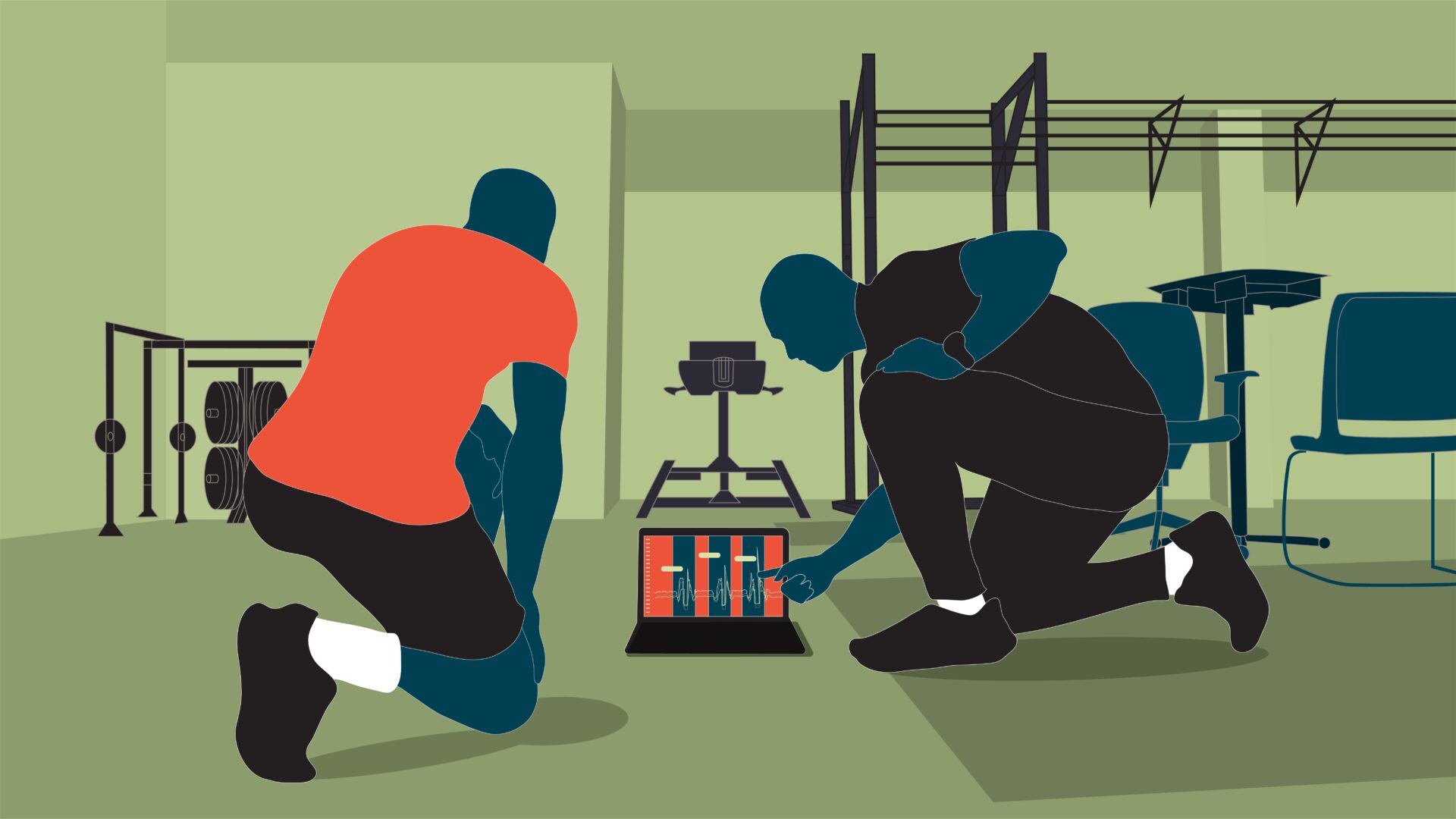
If I ventured more on the sports science side of the weight room, the countermovement jump would be my go-to for assessing readiness. We do it weekly for all players and have specific, individualized meaningful change bandwidths that are leading indicators of neuromuscular fatigue.
Ultimately, the key is not a specific lift or assessment, but that it’s standardized, repeatable, and integrated within our broader monitoring initiatives. This allows us to make sense of how training load, schedule congestion, subjective reports, and everything else factors into performance and readiness.
Force plate data, bar velocity, RPE… there’s no shortage of numbers coming out of a modern weight room. How do you cut through it all and identify which outputs are actually worth acting on?
I have the luxury of starting with our performance database that spans the 10-year existence of the club. This extends far beyond weight room data and includes biometrics, sleep, anthropometrics and field metrics, which are higher quality and more comprehensive than any normative data set I’ve encountered in women’s soccer. It’s allowed me to answer questions on performance over a career and season as well as determine what metrics matter in general, for position groups, and for individuals.
Tweet ThisFeeding data into a central data aggregator and analysis platform allows us to examine everything in context. Essentially, we’re not stuck looking at anything in isolation. Conversely, and crucially, we are able to filter out meaningless metrics.
@mikeyoung
The goal is to minimize the number of metrics that reliably influence changes in training or recovery.
This means first determining and then prioritizing a small number of “actionable anchors.”
Force plates provide more than 100 metrics between the countermovement jump and belt squat. I tend to focus on the 3-4 metrics that demonstrate meaningful insight.
We combine this with strength trends, VBT measures over time, and sprint performance to provide a clear picture. Feeding them into a central data aggregator and analysis platform allows us to examine everything in context. Essentially, we’re not stuck looking at anything in isolation. Conversely, and crucially, we are able to filter out the redundant or meaningless metrics.
Has there ever been a moment where weight room numbers looked fine on paper, but data from another source told a completely different story? If so, how did you navigate that contradiction?
Almost 20 years ago, I thought jump height was a meaningful readiness indicator. But it only took several months to see that it wasn’t sensitive to fatigue when we compared it to wellness surveys or HRV. Recent research backs this up, showing how athletes can unconsciously alter their movement strategies to jump equally high when fresh or fatigued.
I still use the countermovement jump, but jump height is far from my primary concern.
Outside of the weight room, it’s fairly common to see a conflict between biometric data, like wearable-derived sleep scores and HRV, and what the person self-reports.
When there’s a discrepancy, I try to find context by speaking directly to the player and zooming out beyond a single data point. No single data stream ever has veto power. They all get a vote in the larger picture.
Tweet ThisIt’s common to find conflict between biometric data, like wearable-derived sleep scores and what the person self-reports. When there’s a discrepancy, I try to find context by speaking directly to the player and zooming out beyond a single data point.
@mikeyoung
Walk us through how Carolina Courage actually connects the dots between weight room data and everything else you’re collecting. What does that integrated monitoring pipeline look like in practice, and what platforms are making that possible?
I’ve gone through at least six major iterations of my athlete monitoring platform across four clubs. One point of consistency is the need to connect the dots on all aspects of collection.
This starts with ensuring high quality data coming in: data collection standards on the front side, and data hygiene and cleanliness on the back. From there, aggregate the data to a central hub where the picture starts to take shape.
Those first two steps sound simple, but if you drop the ball on one, as they say in data science, “bad data is worse than no data” and “garbage in, garbage out.”
The next challenge is connecting the important but seemingly disparate data points.
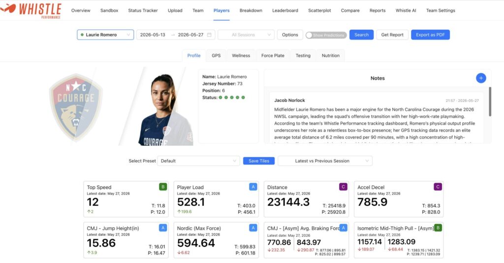
Tweet ThisWhistle Performance removes the need to manually reconcile a mountain of data across a half dozen different systems. It also provides a common “language” and a single environment where coaches, sport science, and medical see the same picture.
@mikeyoung
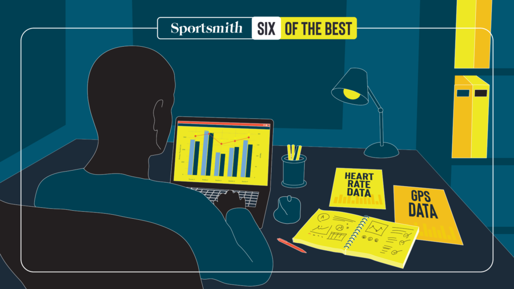
Monitoring initiatives are an integrated ecosystem that incorporate a balance of internal, external, qualitative and subjective measures: GPS data, heart rate data, biometric data from Oura rings, force platform jump and isometric belt squat data, isometric dynamometer readings on hamstring strength, daily wellness survey data, post-session player RPE data, and VBT data from 1–2 regular lifts.
All these data points flow into a central pipeline to display all metrics together over time, eliminating the need to bounce between separate dashboards.
In the past, I built my own central hubs on platforms like Google Sheets, Tableau, and PowerBI. I’ve also used many of the commercial options.
For the past three years, we’ve been using Whistle Performance.
This platform allows me to do what I want without having to spend a lot of time setting it up or coding myself; and without relying on someone to manually reconcile a mountain of data across a half dozen different systems. It also provides a common “language” and a single environment where coaches, sport science, and medical can see the same picture. We can look at field and gym sessions, overlay weight room readiness indicators with performance data, and even look at the effect of on‑field load, travel, and external stressors to flag data that prompt a conversation.
When it comes to data sources, are you still adding or have you got to a point where you’re slowly stripping back? If so, what was the tipping point?
Earlier in my career I had a good understanding of technology and statistical methods but struggled with the sheer volume of data that’s available. Some data streams give practitioners access to hundreds of potential metrics.
It’s easy and tempting to add more and more, thinking that they will improve the monitoring model. But this is almost never the case. Using all of the metrics can be overwhelming at best and misleading at worst.
The aim now is to strip back as much as possible. That’s a challenge unto itself because it’s much more difficult to simplify and distill than it is to add.
The first step is only collecting data that is valid, reliable and accurate. This eliminates a lot of potential data from sports technologies that either are not validated or over promise. That produces a smaller but still massive data haul. Next, eliminate metric redundancy with methods like Principal Component Analysis. Lasso regressions and random forests identify which of the remaining variables are actually meaningful, leaving us with a core of relevant and actionable metrics.
Tweet ThisNext, eliminate metric redundancy with methods like Principal Component Analysis. Lasso regressions and random forests identify which of the remaining variables are actually meaningful, leaving us with a core of actionable metrics.
@mikeyoung
How much of a part is AI playing in how you manage, manipulate and analyze data?
AI has become an unbelievably helpful assistant but is nowhere near able to replace institutional knowledge or coaching judgment.
The early monitoring platforms I developed used machine learning to individualize loading prescriptions and identify red flags that we might otherwise miss.
One of the reasons I switched to Whistle Performance is because the platform already had much of what I was doing, and they were willing to put other concepts into their development pipeline. The platform now has more extensive AI beyond just machine learning. We’re using deep learning‑style approaches to identify patterns we might miss, such as relationships between schedule congestion, travel, training load, and individual responses. We also utilize it to streamline routine tasks like flagging outliers or generating simple readiness summaries.
Beyond that, we have been using AI to fast-track our coding and statistical analysis and build dashboards in a fraction of the time it would take us to build them ourselves.
That said, the final tasks and decisions must remain with the practitioners: interpreting patterns, observations and algorithmic suggestions in the context of the player, the head coach’s game model, and the realities of an NWSL season.
AI helps us get to the right questions faster, but it doesn’t make the decisions for us.
Tweet ThisWhistle Performance now has more extensive AI beyond just machine learning. We’re using deep learning‑style approaches to identify patterns, such as relationships between schedule congestion, travel, training load, and individual responses.
@mikeyoung